Simplified light physics for better colour choices

Hey again!
I’ve been really thinking about this blog topic for a long time now. I will try to keep it short but as simple and informative as I can.
First I should tell you that I’m a sucker for light. I love light and to me it’s more important than anything. As an amateur photographer, it’s drilled in my brain that without light we wouldn’t see anything. Everything would be black. So that is why I always start my paintings with a key light source in my mind.
If you can see anything — anything at all, it means there is light. And it means there is a light direction. And a quality of light.
Short and long wavelengths.
The parts that are in shadow and the parts that are in light.
…and the temperatures for the shadows and for the lights.
As you might now, understanding temperature (and value) means everything for colours to work. If you’re not familiar with this concept yet, please read this wonderful article about it at http://www.muddycolors.com/2015/06/harmonious-color/ to gain more perspective on it.
Basically, there’s one rule:
There is no color. There are only colour temperature relationships.
Color happens in our brain. Here’s a popular ”hammer to the head” example:

No red in that. It’s only a matter of using warmer temperatures for the light parts that appear red, because the key colour is cyan, complementary of reds. This means that the greys will look red to your eye in contrast to the cyans.
If you have the values right and you have the temperature right, you got the colour right.
I personally feel I still have a lot to learn about this topic but I can share you what I have learned so far and what I find extremely useful. So if you’re interested about this, keep reading.
So let’s get back to physics.
To use light physics for making better temperature choices, you only have to understand these two qualities, two lightwaves that are visible to human eye.
Long wavelengths are red.
Short wavelengths are blue.
(And purplish, but human eye isn’t very sensitive to purples so let’s just leave that out of equation)
You can imagine them like this:
The short blue wavelengths are like fragile villagers. They break easily. And when they break, they scatter, and make everything look cooler.
The red long wavelengths are like tough soldiers. They can travel long, bounce off solid objects, penetrate through objects and bounce around them! They make everything look warmer.

So let’s get to the practical examples and to the real stuff! Yay!
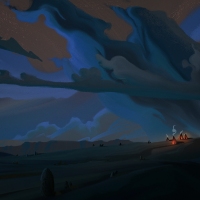
Rayleigh scattering
Rayleigh scattering is one of the most common phenomenon that artists should understand, also known as ”atmospheric perspective”.
Basically, we have all these particles in our atmosphere. You can think of them as the common enemies of the wavelengths. The short wavelengths, the weak villagers, are easily beaten by even the smallest particles. So they get scattered in the air, and we see blue atmosphere. This is why our sky is blue, and why everything disappears into blue the longer the distance. There are just more scattered blues.
This is also why our sunsets and sunrises are warm. As the Earth turns away from the sun, the lightwaves have longer way to travel through the atmosphere. So the weak villagers get scattered along the way, and the tough soldiers survive.
If you’re a tight observer you might think: but if that is true, why is the sky blue from the other side of the sunset? Why would the blue wavelengths survive to the other side?
The blue tint that you get on the other side of the Earth during sunset is actually an incredibly cool phenomenon. You are seeing the shadow of the earth falling on our atmosphere, accompanied with the ”belt of Venus” phenomenon Wow!

Generally sky tends to seem warmer closer to the horizon, as the big particles absorb a lot of light and scatter all wavelengths everywhere unequally, generally making the color more muted compared to the vibrant blue that we tend to see above us.
So basically, the bigger the molecules the more they can scatter other wavelengths too, even the badass red wavelengths. So we will see warmer tones compared to what we’re used to. In a very polluted city or with a very dusty atmosphere the appearance might be warm.
Ambient Occlusion
AO is essential to painting believable scenes and characters without lineart. It’s the dark pass of occluded light that appears really dark. From the other name: it’s contact shadows (and the big gradients that are accompanied by them). It’s present in all lights but less with direct light.
Generally contact shadows and AO tends to be warm, as the long wavelengths are the ones that survive the bouncing around and the little light that penetrates to the darkest corners, usually has the long wavelengths left. This can be helpful to your observation, when you’re staring to darkness and just can’t figure out if what you’re seeing is cooler or warmer.

Reflected Light
Reflected light tends to be warmer for this same reason — the longer wavelengths are likely to survive bouncing around. The more bouncing, the warmer it gets! This is why interiors can be quite warm when direct light is hitting some surface in the room. Even the north light, which is considered cold, is generally warmer than the cool light outside that filters through our atmosphere, not from direct sun.
Anything that light hits, becomes a light source. Any surface. Computer light is probably hitting you right now, and therefore you are a light source. You bounce that light around.
But remember that whenever light bounces, it loses energy. So it doesn’t only get warmer, it gets darker than it was in the surface that it hit first. So for example, reflections that you see in the water are always darker than the subject itself that is reflected.
There’s can be exception to this, though! The example below was a real brainer for me when I first noticed it, but then it became clear after a while.
If direct sunlight is hitting a window, and that sunlight is reflected to the water from a window, and the water is waving a lot, the amount of light from the water can be brighter for your eye than the light from the window. This isn’t really what it is, it’s just what appears to our eye. The light is reflected to all directions from the window in reality, but only one angle of it reaches your eye. But wavy water can reflect that light from other directions to your eye too — therefore the reflection can seem brighter and larger than the actual subject.
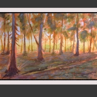
Subsurface scattering
This is my favourite light effect, because subsurface scattering, also known as simply SSS, makes everything glow. This happens with objects that have translucency to them, like skin. The longer wavelengths go through the surface and bounce around inside of the subject, so the subject appears to be warmer and more saturated. You can see this especially when the light is coming from behind.

So without artificial lights, a common outdoor setup could be something like this: key light and fill light. It would be a two point light source. You want to take both of these lightings in consideration if you want to paint details everywhere, meaning you have information in the highlights and information in the shadows, that they’re not overexposed or underexposed.
For example, this two-point light source could mean that your key light is the direct sunlight and fill light comes from the blue sky. Typically the temperature relationship outdoors is warm lights and cool shadows, but don’t get too hung up on it. It all depends on what is happening in the atmosphere. Is moonlight cooler light than the atmospheric light that you see around? Observe and make a judgement call. The colours itself that you pick will only depend on the colour theme that you choose to apply. But the colour temperature relationship is the thing that will hold it all together and make your colours believable and appealing to look at.

Good general rules is, that the highlights tend to lean towards the colour of the light source, midtones reveal the local colour of the object, and shadows are influenced with fill light and bounce light.
There are tons of other light phenomenons and light setups that can be a really cool additions to your paintings, but I don’t want to make this article too long, so I’m just talking about these… for now. If you get the gist of these mentioned ones, you’re already doing pretty well. Like I said, I love light and I could talk about it all day. I’ll definitely geek more about it later.
Happy painting!
-Annamari
You might also like: